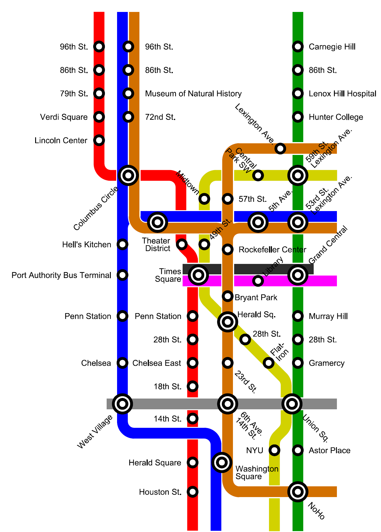
The names of the stops suggest NYC. Enough of them caught my eye quickly enough that I guessed that pretty quickly, although I'm really not very familiar with the city at all.
It's absolutely New York. It just looks strange using the DC Metro visual style, which is the point. I guess it's much less jarring if you aren't used to the different map styles.
Yeah - that scenario doesn't exist in DC, and I didn't feel like making up a way to visually represent it. It wouldn't be nearly as clean as the DC map, which is one of it's most striking features.
It might also be less jarring if you're really used to the DC style. FWIW I think the graphic shows off the strengths of the WMTA style - it's very easy to see which line is which and it's obviously New York. Perhaps it would be a little harder to read if it wasn't a zoom in on central Manhattan, but I'm not sure of that.
Downtown Brooklyn would be a nightmare, as would the vicinity of Queens(boro) Plaza. Also, the text going every-which-way works much worse here than it does on the DC map. This also doesn't cover the express-local behavior, though I'd probably just invert the circle colors for that.
You're right though, it would either need to be absurdly large or very hard to read. DC works because it's fairly compact, there are only a few transfer points, and the stations aren't very dense. The outer edge of the map is all single-line lists of stations. NYC is tangled *everywhere*, so trying to make the transfers clear would require a lot of work and be very hard to follow.
Ultimately, I think the Washington style would work very poorly for New York. It might work better for London. Really, I think it would work better for maps that are already highly stylized, whereas the New York map is fairly realistic.
The attempt to make a stylised schematic of the NYC Subway is generally regarded to have been a miserable failure. Depicting Central Park as slightly wider than it is long was a particular point of ridicule.
If you know which stations you're going between, the stylized isn't so bad. It fails when you try to get to a destination that's located between a few stations on different lines, because you can no longer accurately gauge what the shortest walk is. Outside of the box in the middle, there's usually only one good way to any given point in DC via metro.
The thing about London is that while the stylized map has been very successful, it still has issues. Having a scale map is very handy if you're actually trying to get anywhere in London, because otherwise you can't tell what's actually near what on the surface.
My sister and I had that problem once in London. Everywhere else we'd been, the stops were close together, and in London some of the stops were... And then one day we ended up walking about 2 hours because we misjudged which part of town something was in and accidentally got off three stops early (we got off by Parliament when we were trying to get to the museum district, so it was a very pretty walk, past Buckingham Palace, but very long). If we'd realized how far it was, we would have probably just gotten back on the train.
Brooklyn would just be brutal. Lower Manhattan would be a real problem if you had to tie everything to Brooklyn, but if you abandon a chunk of the geography and forget about some of the longer transfers, I think it's workable.
no subject
Date: 2008-03-09 06:30 pm (UTC)no subject
Date: 2008-03-09 06:38 pm (UTC)no subject
Date: 2008-03-09 07:42 pm (UTC)I notice you don't bother trying to connect the three Long Passageway transfers, nor the Metrocard-only transfer. Probably wise.
no subject
Date: 2008-03-09 07:45 pm (UTC)no subject
Date: 2008-03-09 07:59 pm (UTC)no subject
Date: 2008-03-09 07:46 pm (UTC)no subject
Date: 2008-03-09 07:56 pm (UTC)You're right though, it would either need to be absurdly large or very hard to read. DC works because it's fairly compact, there are only a few transfer points, and the stations aren't very dense. The outer edge of the map is all single-line lists of stations. NYC is tangled *everywhere*, so trying to make the transfers clear would require a lot of work and be very hard to follow.
Ultimately, I think the Washington style would work very poorly for New York. It might work better for London. Really, I think it would work better for maps that are already highly stylized, whereas the New York map is fairly realistic.
no subject
Date: 2008-03-09 08:02 pm (UTC)no subject
Date: 2008-03-09 08:07 pm (UTC)no subject
Date: 2008-03-09 08:10 pm (UTC)Also, how long did the old E run from 179th to Rockaway take? Longer than the A, right (which is the longest in the system, no?)
no subject
Date: 2008-03-10 05:23 am (UTC)no subject
Date: 2008-03-10 05:26 am (UTC)no subject
Date: 2008-03-10 05:49 am (UTC)no subject
Date: 2008-03-09 07:57 pm (UTC)no subject
Date: 2008-03-09 08:02 pm (UTC)no subject
Date: 2008-03-09 09:19 pm (UTC)